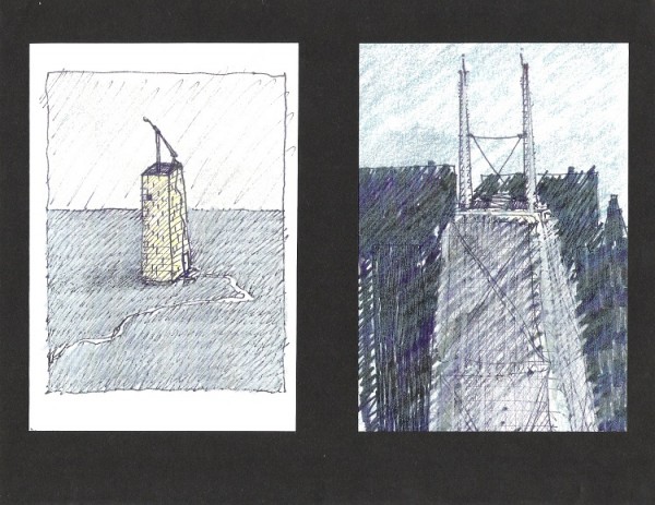
One day, my boss decided to bring in some of his design work to show to everyone in the office. He called us into the main conference room for a meeting. There, he had several drawings pinned up on the wall – a sample of the work he had done while he was in school. He stood by his drawings, gesturing, and began to explain the design concepts for each of the projects. I think he used the word “intervention” Let’s just say it was awkward. I think I may have bitten my tongue in half. That day, I vowed to never show my “design” work from my “studio” days, to anyone. ever. ever. never. ever. *shudder*
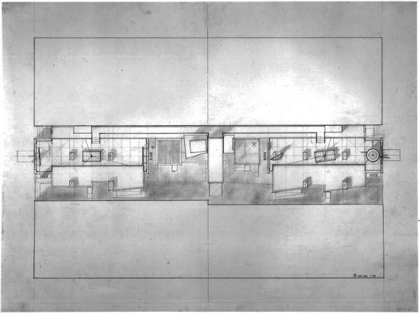
Soooo, Let’s take a look at a selection of work from my 5th year design project. In this project, I was trying to represent, in built form, the contradiction between the individual and the community. It’s an urban intervention, if you will. *Jody begins to gesture*
.
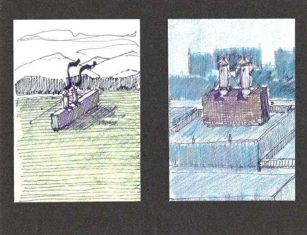
smokestacks in the middle of a wheat field. that’s a thing, right?
.
.
.
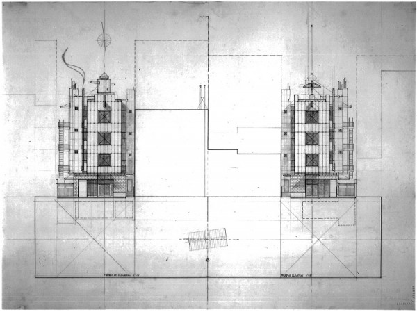
 Those two small structures in the middle are homeless shelters. I was sharing the loneliness. And, the main building includes elevators for the cars, why not?
.
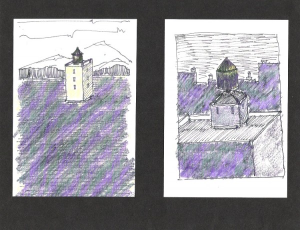 Is lonely a valid design concept? I hope so.
.
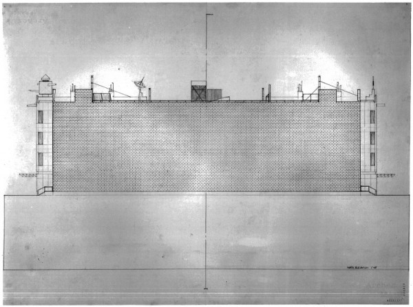 This is the wall of the building that is up against an adjacent building. You could never see this view. I drew every brick. All of them. It took me 2 days.
.
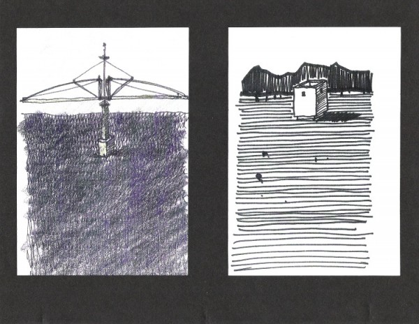
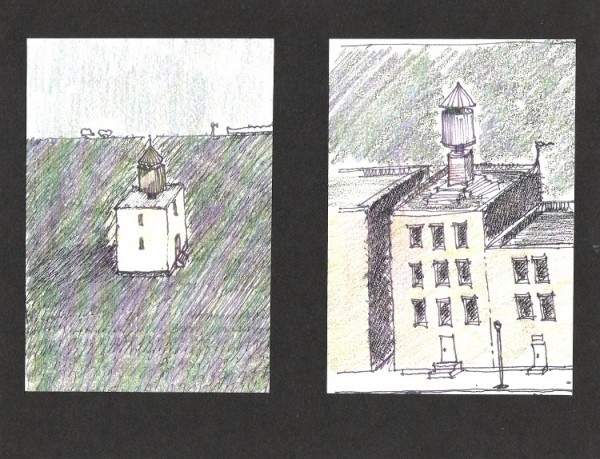 I still hold the record for largest number of water towers in a project.
.
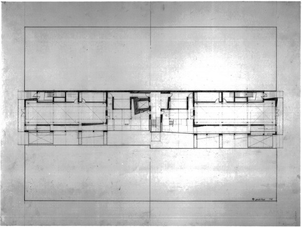 That’s the ground floor, and room labels are for wimps.
.
.
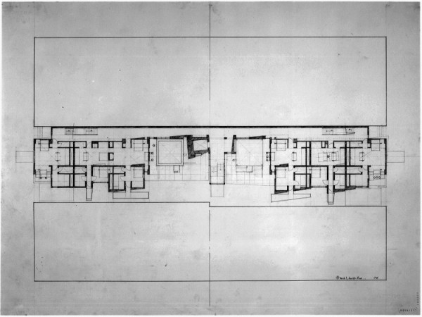 Second floor, lots of rooms and things.
.
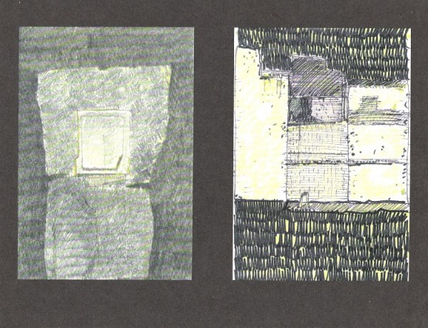 I have no idea. I drank a lot that year.
.
.
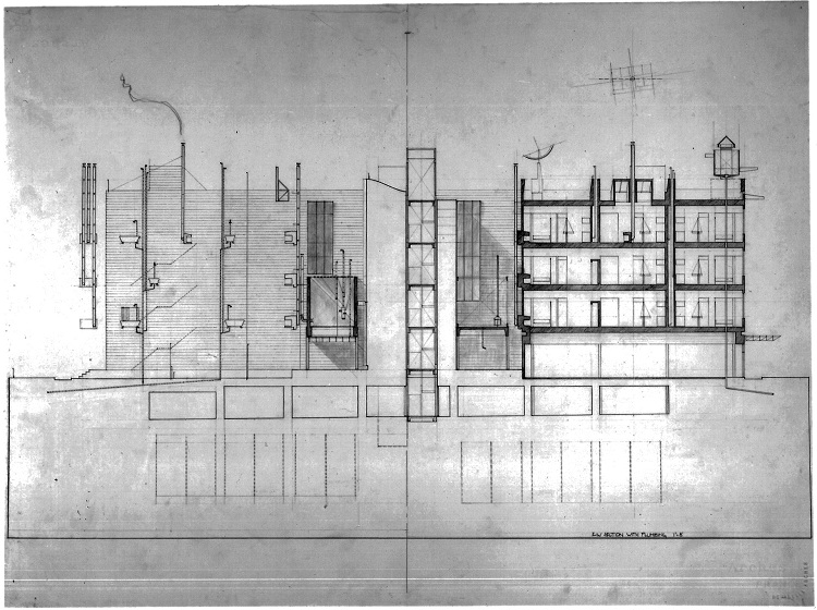
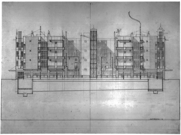
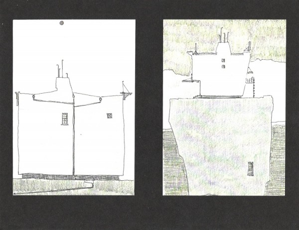 Pipes, downspouts, drains, Rene Magritte, this is not a pipe.
.
 Section with plumbing. Ok, this drawing is kind of awesome.
.
.
.
still.
awkward.
.
Feel free to share some images of your own student work. I promise to roll my eyes dramatically. I might even sigh.
Jody

