
Great architectural achievements as reviewed by my neighborhood design board.
Overly simplistic use of materials. No sense of privacy. Roof doesn’t drain water. Needs a cornice.
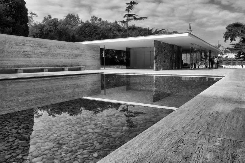
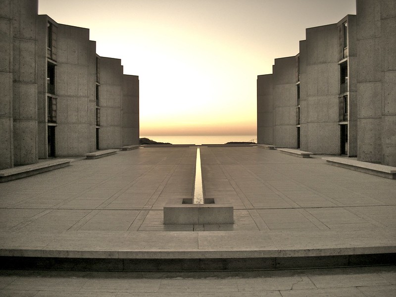
Ill-defined public realm. Out of context with the surrounding neighborhood. Poorly defined entrance. Looks like a gas station. Needs a cornice.
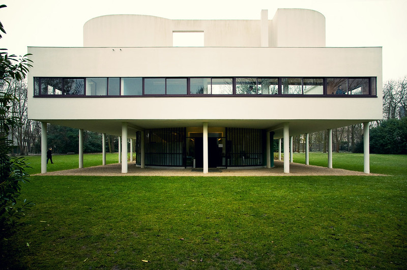
Poor articulation of base middle and top. Lack of pedestrian scale. Ribbon windows could be improved with shutters. Needs a cornice.
Undulating form undermines the definition of the public realm. The fountain is a tripping hazard. Should add a railing. No storefront articulation at ground level. Needs a cornice.
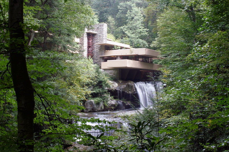
Cantilevered floors appear to be structurally over-spanned. The basement is actively leaking. Needs a cornice.
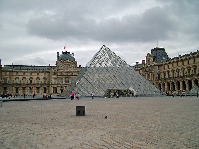
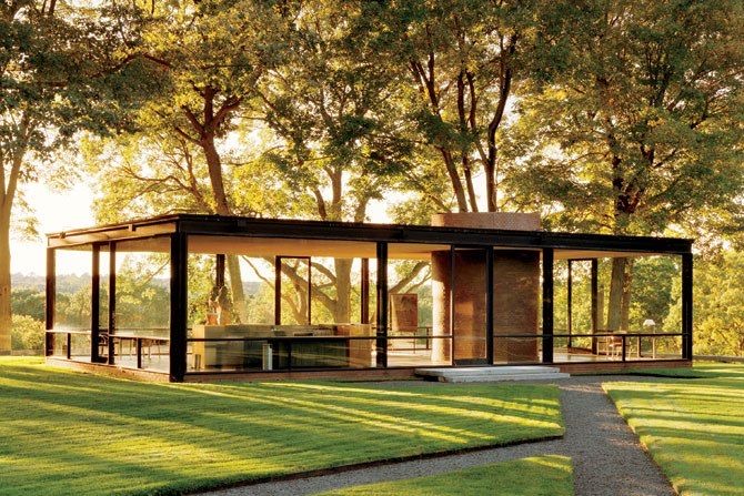
While I appreciate the reference to ancient Egypt, the excessive use of glass is inconsistent with the pattern of the surrounding buildings.
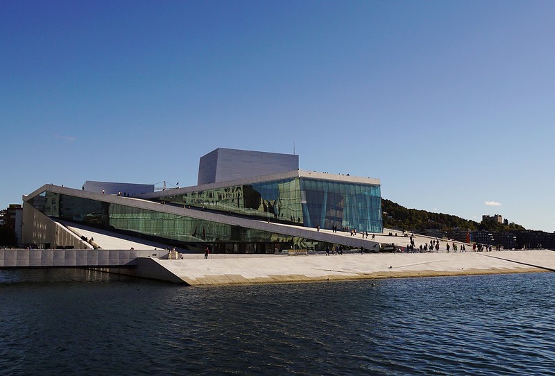
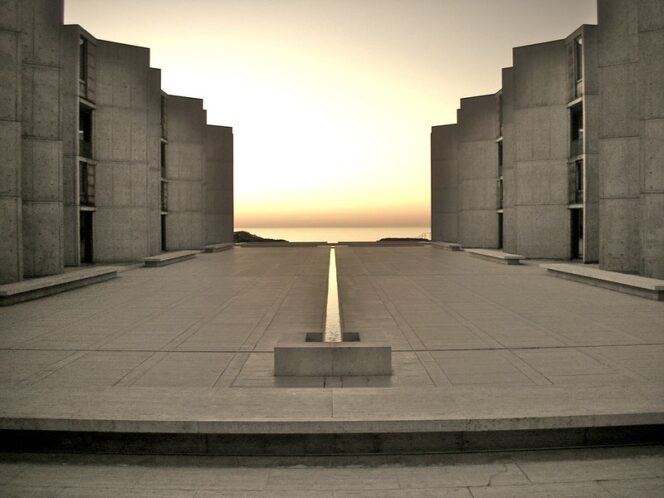
Aggressively anti-urban public realm. Appears to slide occupants into the sea. Arbitrary distorted forms. Needs a cornice.