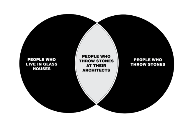
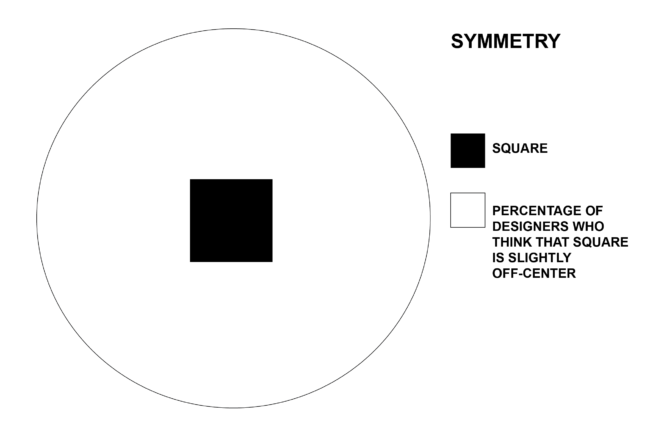
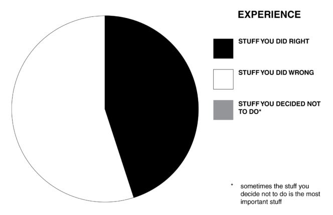
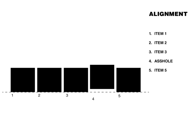
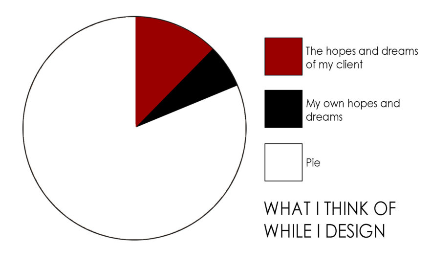
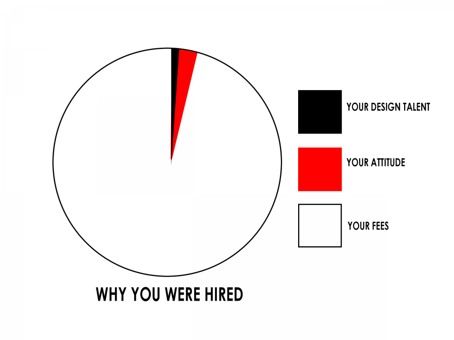
Design is hard. If only the process could be explained using simple venn diagrams. Unfortunately, this isn’t that: More Design in charts – HERE, and HERE and HERE and HERE and HERE
Design explained using pie charts again
Design is hard. If only the process could be explained using simple pie charts again. Unfortunately, this still isn’t that: More Design in charts – HERE, and HERE and HERE and HERE
Design explained with pie charts
Design is hard. If only the process could be explained using simple pie charts. Unfortunately, this isn’t that: More Design in charts – HERE, and HERE and HERE
Design explained with Bar Charts
Design is hard. If only the process could be explained using simple bar charts. Right. This isn’t that: More Design in charts – HERE, and HERE
Design Paths 2
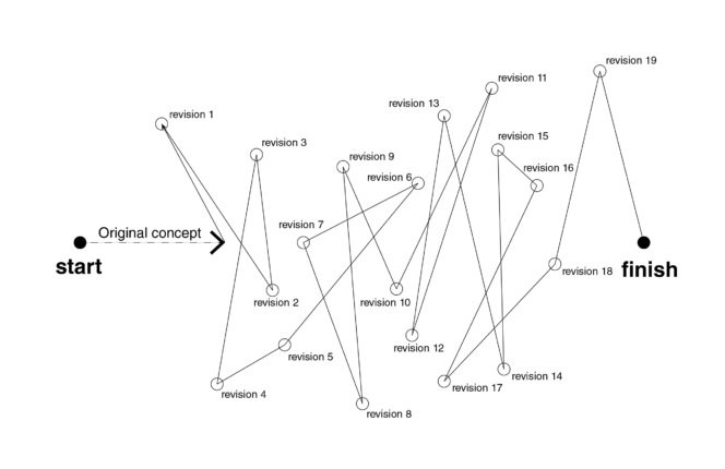
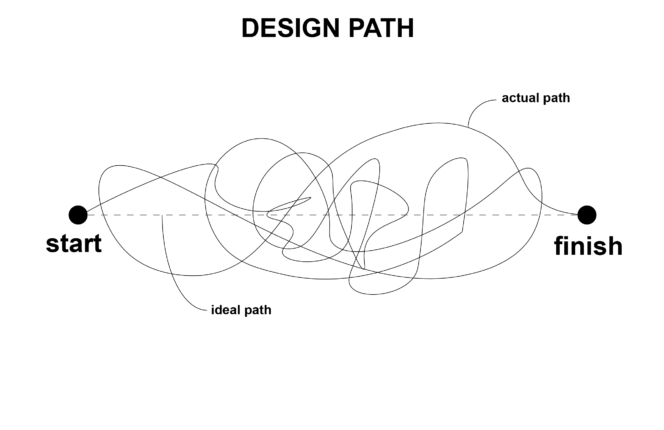
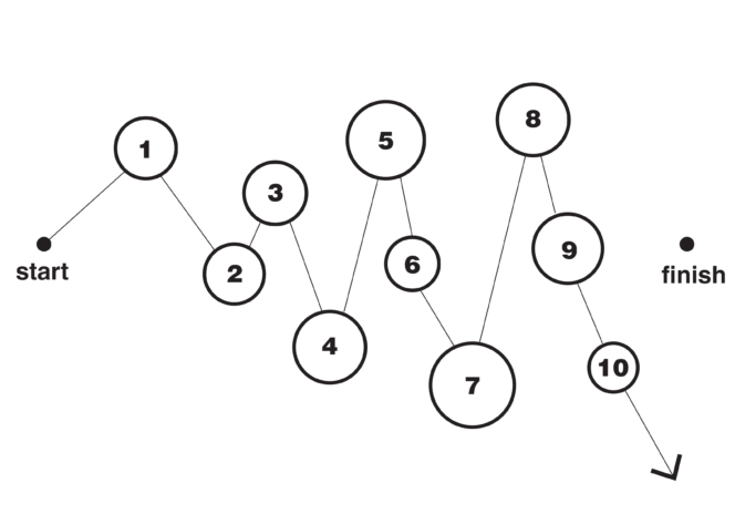
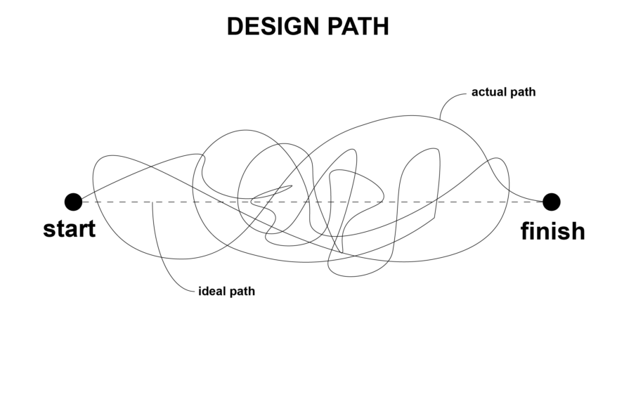
Design is hard. The path you follow from start to finish is never a straight line. If only there were another handful of clear diagrams to explain the process. This still isn’t that: More Design Paths HERE
Design Paths
Design is hard. The path you follow from start to finish is never a straight line. If only there were a handful of clear diagrams to explain the process. This isn’t that:
Options
Option 1: Gut instinct, emotional, emotive, missing key program elements, kind of awesome. The client loves it, then calls the next morning to ask for other options. Option 2: Reasonable, functional, includes most of what the client asked for, beige, bland, kind of sucks. The client thinks it’s “almost there”. Option 3: Drastic departure from the program, awkward, hastily rendered, … Read More

